


Fruit stickers, polluted posters, and the iconic shirt that’s bringing Canada together


Patriotic objects
I was on vacation in England for spring break, specifically in Liverpool and London. Meanwhile back home in Canada, a looming trade war was focusing patriotic feelings as a bully to the south lashed out unprovoked. Walking for hours around cities that combine Victorian (often slavery-financed) splendour and modern glamour, I was struck by the common sights that made the urban settings unmistakable British.
Our North American cities have familiar features that straddle the US-Canada border. That’s why Toronto is a frequent onscreen stand-in for American cities. With its older heritage, Montreal has often been cast as Europe in Hollywood movies. But there are certain architectural styles that only exist in Britain, and a midwestern home with a pick-up in the driveway could never be mistaken for anywhere across the Pond.
Aside from buildings, infrastructure is designed differently in different countries. Each country’s national postal service mailboxes are instantly recognizable to the citizens of Canada, the UK, and the US. Taxi cabs vary by city. Some familiar objects in urban landscapes are uniquely patriotic. They provoke an emotion – a deep sense of home and belonging. For Brits, some examples would be red telephone boxes and double-decker buses (also traditionally red, just like the country’s postboxes). They are so unique to the UK and have been for so many generations that they are now a fundamental part of Britain’s cultural fabric.
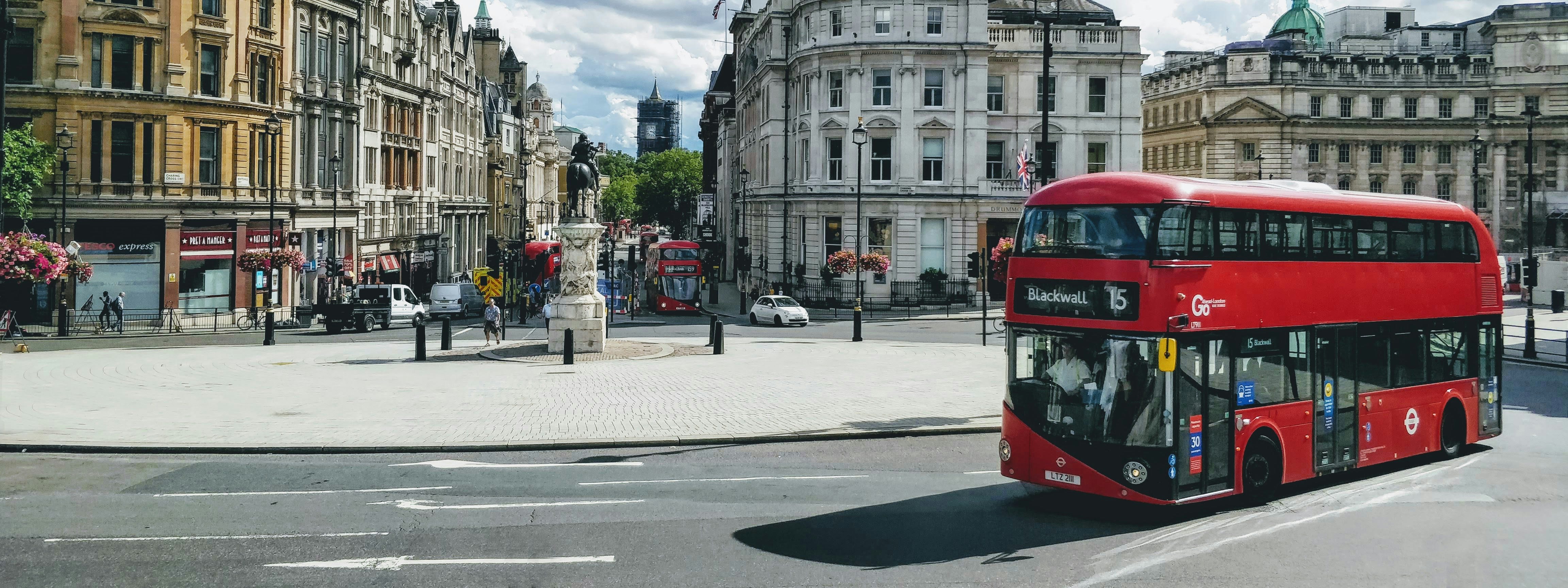
At a pivotal moment in history, with its sovereignty under threat for the first time, it’s a pity that Canada has never developed truly distinctive designs for any of the objects in our built world. Sure, our mailboxes are red, but their physical design is almost indistinguishable from their counterparts south of the border.
(The patriotic objects I’m referring to go beyond the ceremonial. So the Mounties don’t count.)
Ideally, we Canadians would have had our own version of the double-decker bus, but we don’t. Poutine? Nice try. Is there anything we see consistently in daily life from coast to coast that wasn’t imported from our neighbours? What clearly says “I am Canadian”? That phrase provides the clue. In Canada’s hour of need, what has re-emerged to reclaim our cultural independence? Yes, a Molson beer ad. But there’s something in the ad that isn’t beer.

The original commercial and its unbranded 2025 remake feature the same actor, Jeff Douglas, wearing garb from Canada’s mythical past. Over the centuries this no-nonsense item of clothing has evolved to become an unofficial national uniform. You know what I’m talking about: the plaid flannel shirt.
Stereotypically red, the Mackinaw “buffalo plaid” is as Canadian as it gets outside of the natural world of beavers, maple leaves, and migrating geese. Even legendary British comedy troupe Monty Python knew the symbolic power of a lumberjack’s shirt. Interestingly, the original version of the ad, from the year 2000, saw Douglas wearing a green plaid. When he and a bunch of anonymous colleagues recreated the look and feel of the Molson ad for a new political and cultural climate, it’s noteworthy that he switched to the iconic red.

So it turns out that we do have a patriotic object to rally around. From east to west, north to south, from First Nations to new Canadians, from English speakers to French speakers, the plaid flannel shirt speaks Canadian. And so do we whenever we wear it.

Giving air pollution top billing
The air around us doesn’t always look polluted, so it’s easy to overlook that 99% of the global population breathes air that exceeds WHO air quality guideline limits. Netflix is putting this hidden reality at centre stage with its marketing campaign for the upcoming TV series Toxic Town. Its promotional posters, created by the marketing agency Dentsu, are sensitive to air quality, matching their clarity to local air quality data readings in several UK locations. The more polluted the air, the more smoke-obscured the poster is, until all that’s left is a message reading “You can’t see this ad, because the air quality is currently poor.”

This is a fitting statement for advertising Toxic Town, a show that follows the true story of the poisoning of dozens of children in the English town of Corby, who were born with limb differences due to airborne toxins from the town’s waste removal operations. Their families fought a ten-year legal battle to prove that it was, indeed, those invisible toxins that caused birth defects in the town. These promotional posters address a core human shortcoming: that when it comes to more discomforting realities, we often need to see it to believe it.
Giving brains more comfort
Ergonomics, associated mostly with comfy-looking sloping furniture, is about reducing friction between humans and our manmade environments. Ironically, the word sounds pretty uncomfy if you ask me (URGHonomics?), and its offspring, neuroergonomics, sounds even less comforting.
But what is neuroergonomics, and why might it be coming to a workplace near you? Neuroergonomics aims to adapt the human brain to its environment through brain monitoring and stimulation. Due to advances in non-invasive, wearable technology, it’s becoming more accessible, but the most common neurotechnologies are still pretty conspicuous, involving either attaching little electrodes to your scalp (EEG), or shining infrared light through the skull to measure metabolic activity (fNIRS).

Workplace neuroergonomics holds some intriguing possibilities: it could help monitor fatigue in jobs where it would have significant safety consequences, and help employees work with and enhance their brain function to complete tasks with more ease. There is some evidence that transcranial electrical stimulation improves performance on both cognitive and motor tasks.
But, of course, there are a number of uncomfortable dystopian questions to consider. Will employees be discriminated against because of their unique brain quirks? Who owns the brain data tracked by an organization, and how will it be protected? Will this technology devolve into a higher-tech version of the dystopian Nidle (“no idle”) machine used in Bangladeshi sweatshops, which constantly surveils workers to make sure they’re performing at their absolute limit, lest they be fired? I would rather stick to the comfy egg-shaped chairs than find out.
Giving guacamole a chance
Ever thrown away a perfectly good avocado? You might have without even realizing it. Avocados, bananas, and mangoes are among some of the most-wasted produce because their over- or under-ripeness can make them seem inedible or unusable when in reality, they might just be better for certain recipes. A common example: using black bananas to make banana bread.
That's why Colombian grocery store Makro created fruit stickers that show the potential hues of produce at different life-cycle stages to match ripeness levels, along with recipe suggestions. To take the example of avocados, they suggest “baked,” “guacamole,” and “sauce” for increasing ripeness levels. To decrease waste even further, prices at Makro stores were adjusted so that riper fruits were sold at a discount.
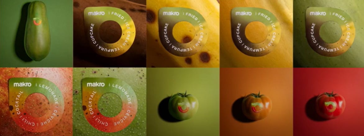
The campaign, created by VML & Grey Colombia, was rolled out alongside a social media campaign to educate the public at large about food waste. It shows that you don’t need fancy tech or a huge budget to make an impact, just a novel idea that bears fruit for both customers and providers alike.

Frank Gehry, renowned architect
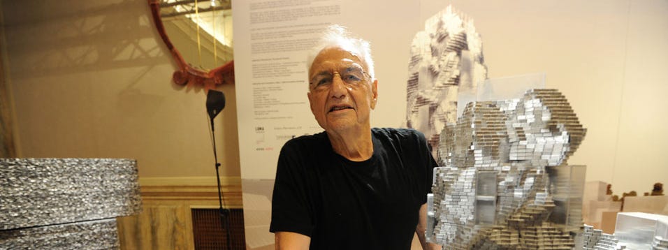
“Architecture should speak of its time and place, but yearn for timelessness.”
In the intro to this edition, I talk about how unique features of our built environment create a shared culture that endures across generations. When it comes to iconic architecture, nobody does it better than Frank Gehry. The Toronto-born architect is now 96 and still actively pushing esthetic horizons, from Bilbao to Cleveland, and from Prague to Los Angeles.
.jpg)

Discursive cursive
I presume it comes as no surprise to hear that young people are unable to write in cursive. In the twenty-first century, Tapping and scrolling on screens is mightier than the pen. But is it possible that forgetting how to write by hand might cause more problems than economic anxiety for ink suppliers?
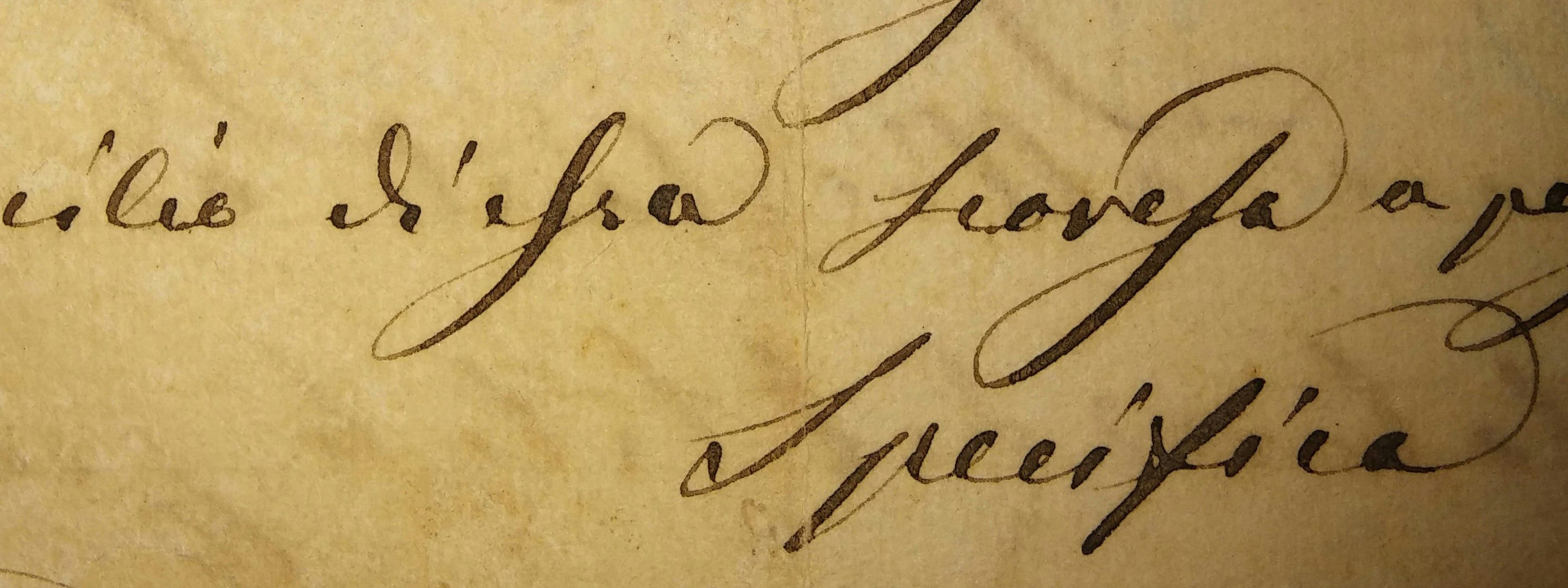
In her new book, The Extinction of Experience: Reclaiming Our Humanity in a Digital World, Christine Rosen, a fellow at the Institute for Advanced Studies in Culture at the University of Virginia, investigates the hypothesis that our cognitive abilities are declining as we detach ourselves from tactile activities in favour of digital ones. She analyzes the decline of handwriting, from robotic autopens used to sign government documents and autograph fan memorabilia, to the fast-approaching extinction of classroom cursive.
Rosen cites research showing that students who take lecture notes using a laptop assimilate information less effectively than those who write by hand in a notebook. The theory is that forcing ourselves to put pen to paper limits the amount of words we can write. This means that we have to summarize what a professor is saying as they speak and that makes us remember better. But the benefits of tactile activities go beyond writing. Learning a musical instrument or a craft such as knitting or woodworking provides emotional as well as cognitive benefits. Handmade art and products may not only have an artisanal charm, they are good for the soul for both maker and receiver.

Worlds collide in interview form

This newsletter used to feature a 1-question interview where I would quiz an expert in their field on a subject relevant to the feedback loop between brands, culture, and tech through a single question. Although that section has now transitioned to a single quote, the 1Qi recently gave birth to a podcast episode in which one of my guests interviewed another! This was no coincidence.
After being interviewed by me, British marketing guru Adam Morgan asked me to put him in touch with previous interviewee Simon Peacock, a friend and video game director. The result? This episode of Adam’s podcast Let’s Make This More Interesting, where he goes in-depth with Simon on subjects ranging from being a professional improv performer to how he got his break in the video game industry, and directing hit franchises such as Assassin’s Creed.

Decolorizing DZ
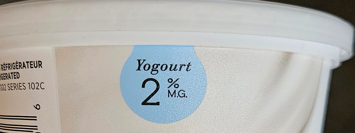
Eagle-eyed readers might have spotted a change from the norm in this edition of Discomfort Zone. Until now, this newsletter has used American spelling. When I originally created it, I made the conscious choice to write “color” instead of the Canadian “colour”. Why? Because I expected the majority of my subscribers to be in the United States. (Are they? I have to check…) Now, geopolitical events have spurred a patriotic shift. Henceforth, you can expect to see spellings such as “travelling”, “yogourt”, “dialogue”, “centre”, “glamour”, and, of course, colour.
Did you enjoy this issue of Discomfort Zone? You can comment directly in the Substack app or drop me a line by emailing me at john@johnbdutton.com.
And why not connect with me on LinkedIn if you haven’t already?
FOMO food research and writing by Silvia Todea, editing by John Dutton.
Legal disclaimers:
All images in this newsletter that are not the property of the author are used with permission or reproduced under the fair use provisions of the Canadian Copyright Act while giving appropriate credit.
The content published in this newsletter represents the private views and opinions of John B. Dutton and are not in any way connected to his role with the National Film Board of Canada.